
CEAT is one of India’s leading tyre brands providing world-class products and services across 110+ countries. They approached with the idea to revamp their product catalogue for truck and bus tyre, catering to the European market. The challenge was to develop a fresh visual language for the catalogue while adhering to the global CEAT branding. The catalogue consisted of 6 key products, technical details, brand overview, and other mandatory info.

The Challenge
Given CEAT’s global reputation as a brand, it was imperative for the new designs to maintain consistency with the established brand identity while also introducing a distinctive design element that sets this brochure apart from their other offerings. Additionally, we needed to consider the target audience and the competitive landscape within the market, striving to create a design language that resonated effectively.
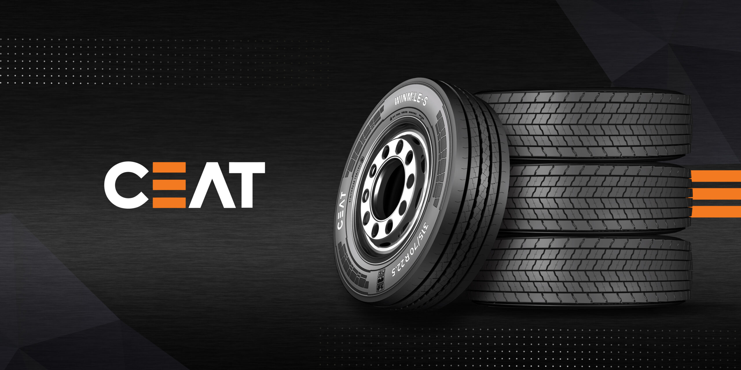
Following numerous iterations and explorations, we arrived at specific design choices and visual elements. These included incorporating a graphite texture, implementing metallic finishes, utilizing bold typography and prominent imagery, and prominently featuring CEAT’s signature 3 orange lines. These strategic decisions collectively shaped the entire brochure, ensuring it aligned with CEAT’s brand identity while simultaneously standing out in the market.


